CHATSWORTH ROAD
The homeowners wanted to divide their three-story home into two separate flats – one for renting and the other for personal living. We were asked to redesign and reconfigure the building to maximise space for both residences.
Rees Architects were also responsible for planning, all of the interior design, kitchen design and selection of fixtures and fitting and project management of the build. This included:
Internal alterations and structural works to accommodate a basement conversion and loft build
Extension design and build
Lowering and levelling of basement floor
Acoustic testing and separation
Full kitchen design (Ikea wall units and British Standard cupboards with bespoke handles and worktops)
Bathroom design
Full decoration and specification of finishes
Mechanical and electrical design (heating, lighting, sockets switches etc.)
Window refurbishment: sash window frames replaced and double glazing fitted
Bespoke joinery design
Specification and purchase of furniture, blinds, rugs etc.
Flat A was allocated the ground floor and basement
Flat B was made up of the first floor and loft conversion
MAKING SPACE
We dug the basement floor and re-levelled it so that you step down into the new living space once you reach the bottom of the staircase giving the basement rooms more height. This also meant that the bi-fold doors in the kitchen opened directly on to the patio and decking, ideal for warmer days and entertaining. The new floor was poured concrete with underfloor heating combining functional design with a luxurious edge.
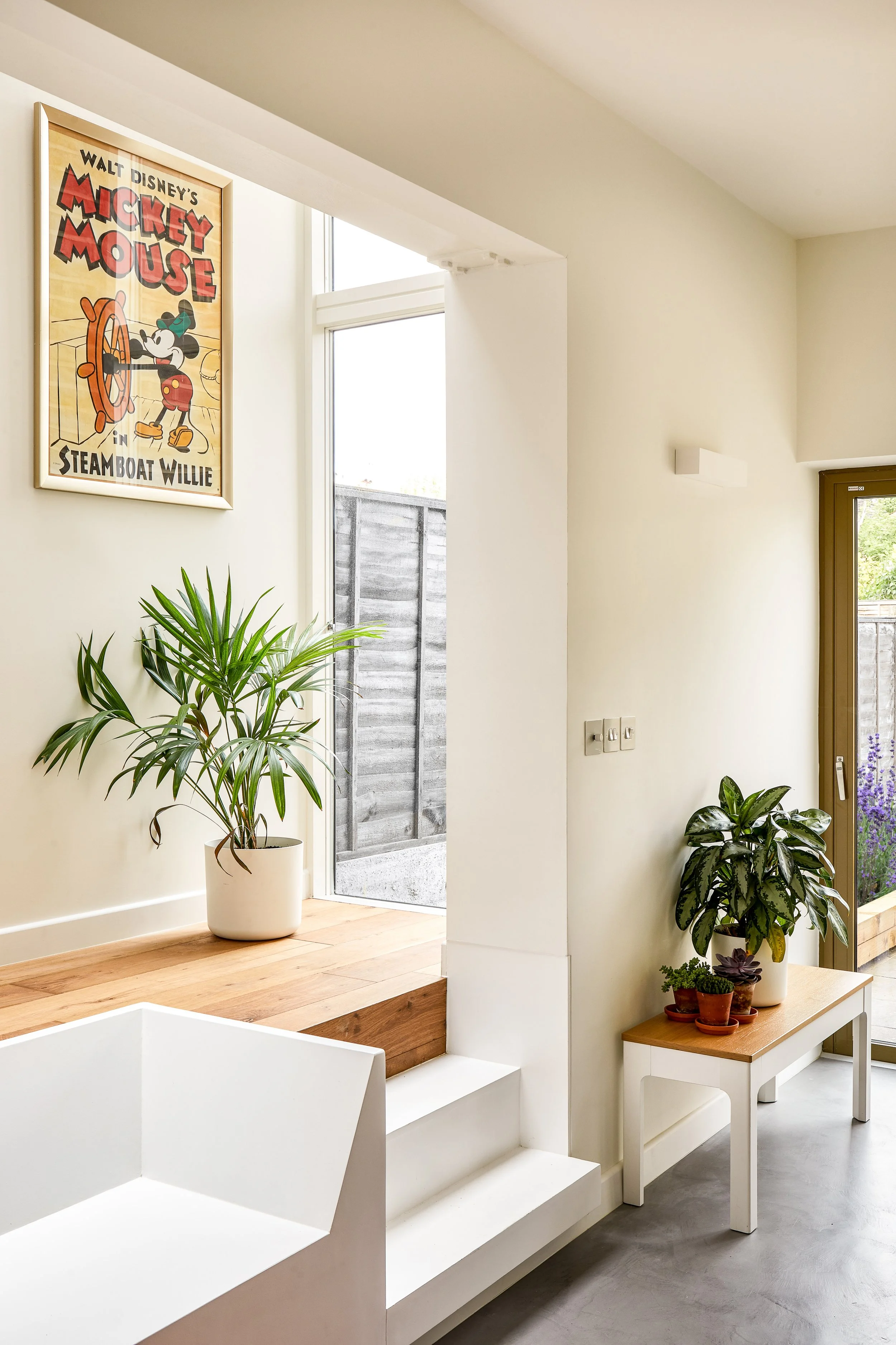
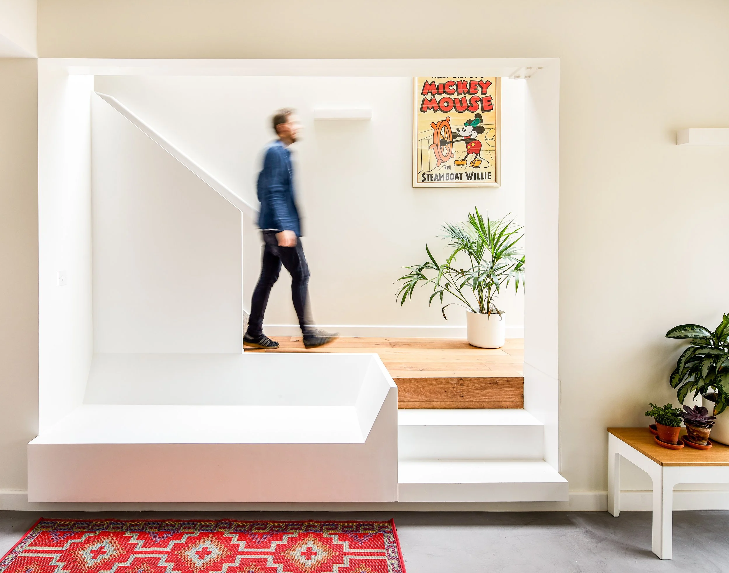
We built a bench into the alcove next to the steps down into the kitchen which merged with the staircase balustrade above providing a cosy lounging space or alternative to sitting at the table. The lines that this composition creates viewed from the kitchen also frames the lightwell created by the glass extension and draws in natural light. On the other side of this white frame, we maintained the exposed brickwork of the original wall around the archway.
In the middle section beyond the kitchen, we fitted a shower room and utility room before emerging back in to the light of Bedroom 3. Previously this space had been an old-fashioned cellar with a dirt floor so was unusable for much else. Along with re-levelling the floor we made this room fit for purpose and ensured the lightwell above brought in a good amount of daylight through the window. With two more bedrooms and another shower room above the basement, Flat A provides ample room for a family.
The main job in converting Flat B was building the loft and balcony. The layout of the third floor lent itself well to the new configuration meaning we only needed to equip Bedroom 1 with an ensuite shower and then fit a second shower room with toilet. We built storage space for coats on the landing and built-in cupboards for both bedrooms. At the bottom of the stairs there was another large storage cupboard allocated to Flat B.
The loft itself was given two rooflights and sliding doors on to the balcony ensuring that it was a light and airy kitchen-living space.
ENLIGHTENED ANGLES
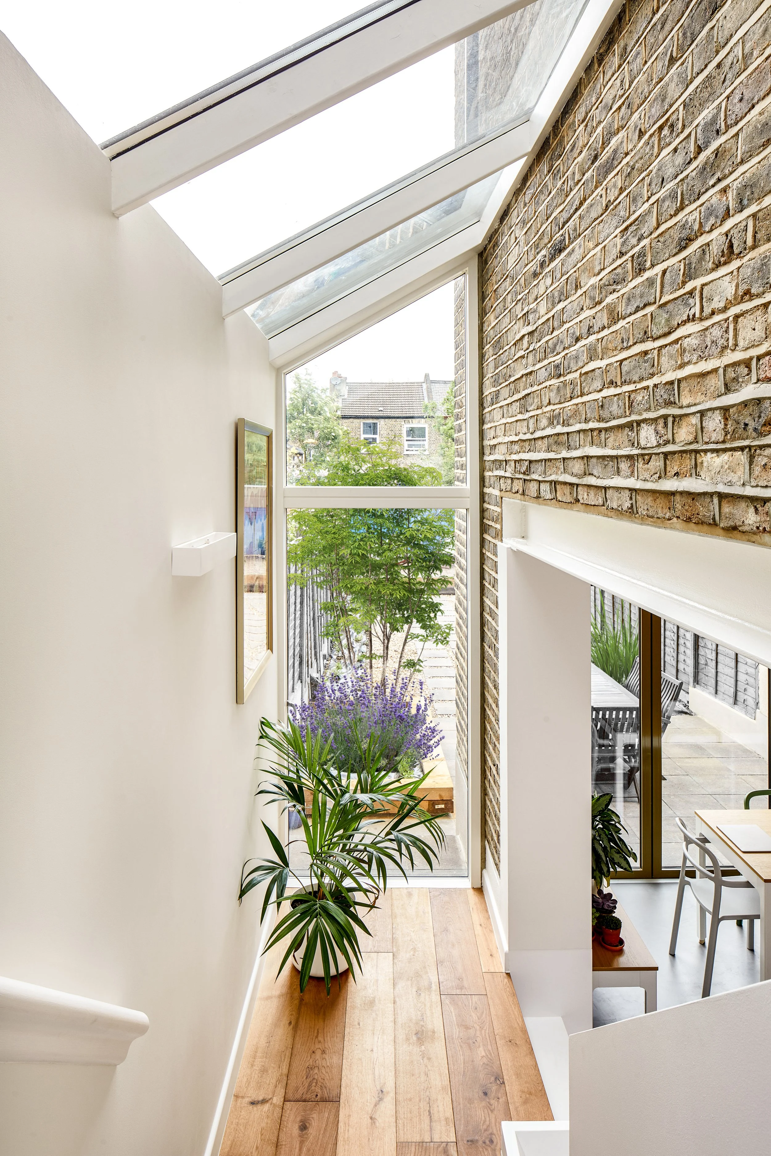
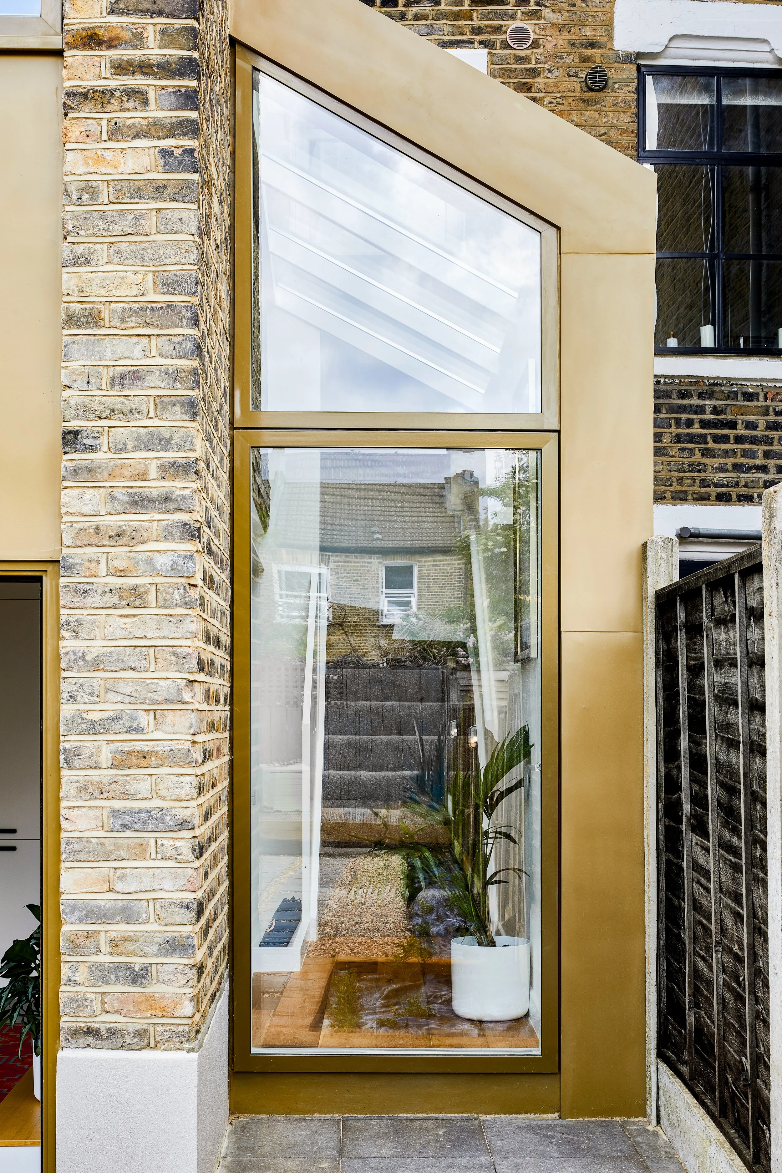
The stairwells for both flats offered the perfect opportunity to let in light in creative ways. The glass casing of the extension at the bottom of the staircase to the basement allows light in from above and via the full-length garden window, while a window at the top of those stairs brings light into the upper hallway. We took advantage of the angles that the turns in the staircases provided and how this manages to almost bend light around corners thanks to the white walls and ceilings. This works particularly well with the angled window at the top of the loft stairs which manages to direct light down two storeys unencumbered.
The bedrooms were all given shutters which let light in at the same time as providing privacy. The slats create shadows that give the white walls depth and dimension.
Using wooden splashbacks in the kitchen space was a practical decision as they are easy to wipe down and maintain but also provided a design feature. By painting the wood the same grey as the kitchen cabinets but then using the datum line to create a horizontal break above which the wood was white to match the walls and ceiling, we created the illusion of more space and a higher ceiling
EYE-CATCHING EXTERIORS
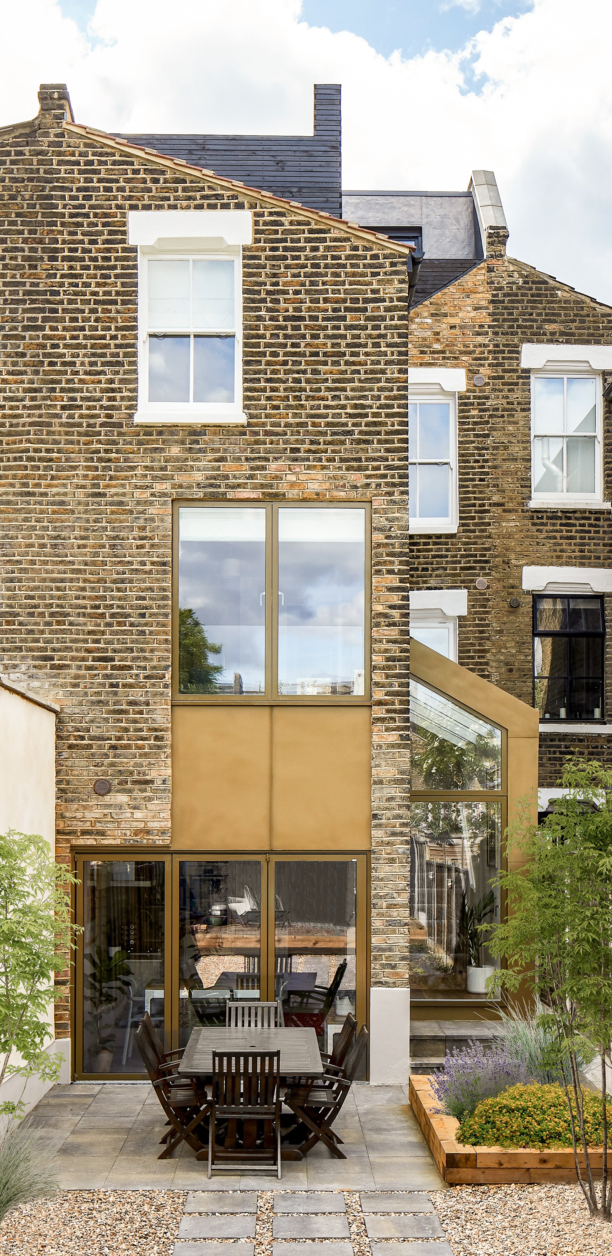
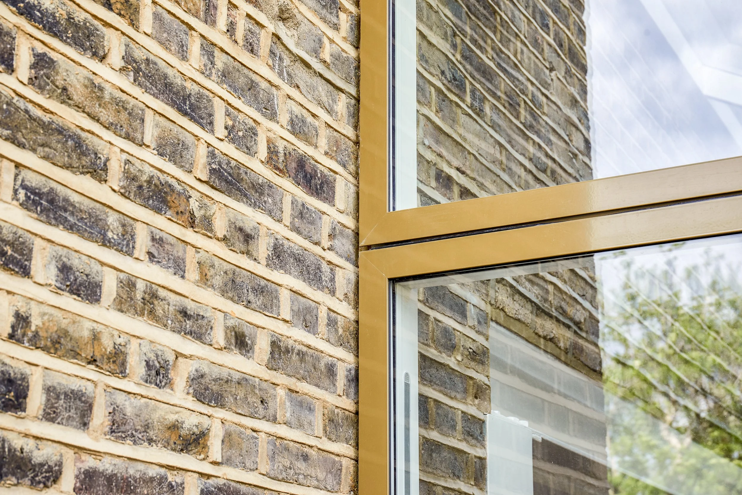
The side extension was a powder-coated aluminium and glass structure that added a sculptural element which we wanted to reiterate across the back of the property. So we used the same effect on the bi-fold doors and ground floor window directly above. Then to create a dramatic column which accentuates the height of the building, we continued the line between door and window with two metal panels. The colour of the cladding sits well with the brickwork but provides a juxtaposition of textures and of modernity with tradition.
To compliment the lead roof cladding on the loft exterior, we used black timber to create a high fence that kept the balcony private and drew the eye outwards rather than on to neighbouring properties.
The frontage of the property was re-rendered and painted a dove grey that was in keeping with all the new design touches.
SAFE, SOUND, SUSTAINABLE
When converting a house into flats, acoustic separation between floors is vital. We tested both airborne sounds (e.g. talking) and impact (e.g. walking, bass from music). Insulating against both these kinds of noise needs the solidity of a mineral wall and the absorption of a rubber layer. It’s an extensive process but the results are worth it (as anyone in a flat that is not well sound insulated will tell you!)
We installed a misting head over the stairwell up to the loft which meant that there didn’t need to be a fire escape worked into the plans. The mechanism gives a safe amount of time to exit via the main stairs in the event of a fire in the kitchen.
The metal cladding of the extension was painted with intumescent paint which creates a barrier between potential fire and the metal. This gives extra time to exit before the metal begins to warp from heat and is in line with fire safety standards.
In buildings, heat loss is the main cause of energy inefficiency. With an older structure, converting or extending provides a key moment to improve insulation for considerable cost-saving and a more environmentally-friendly home. We refurbished the sash windows throughout by adding draft deals and double glazed units. Insulated plaster boards were also used on old, solid brick walls to minimise heat escaping from the core of the structure.
Embarking on a project?
We’d love to hear about it.
We truly appreciate your interest in working with our practice. Please complete our form, sharing as much detail as you can. Once we've received your submission, we'll be in touch to arrange a meeting with our Director, Daniel Rees.
Our residential projects typically have budgets starting from £500k, with costs generally ranging between £3-5k per square metre. This investment level allows us to achieve the quality of design and finish our practice is known for.


