VICTORIA PARK
We designed the refurbishment of this duplex flat in Victoria Park, making it fit to rent in this sought-after area of East London.
SCOPE OF WORKS
We were responsible for all of the interior design, kitchen and bathroom design, bespoke joinery design, and the selection of all furnishings, fixtures and fitting. The scope of works included:
Internal alterations and structural works; removing/replacing walls to give improved layout.
Structural works to existing floor: levelling and reinforcing what was a defective structure that was bowing and putting strain on the walls.
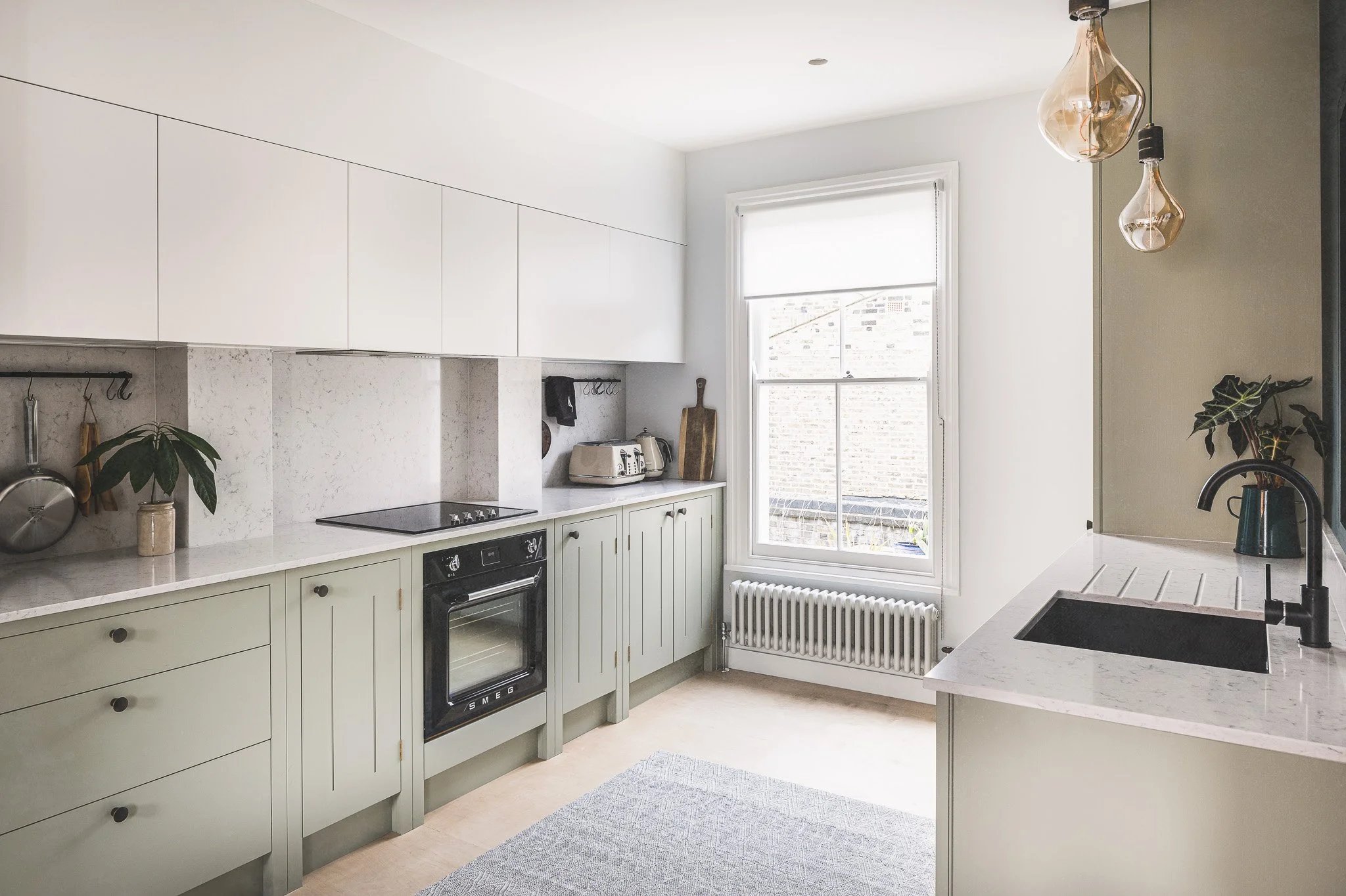
Full kitchen design (Ikea wall units and British Standard cupboards with bespoke handles and worktops.
Bathroom design.
Full decoration and specification of finishes.
Mechanical and electrical design (heating, lighting, sockets switches etc.)
Window refurbishment.
Bespoke joinery design, wardrobes, boiler cupboard, utility cupboard.
Specification and purchase of furniture, blinds, rugs etc.
INTERCONNECTED INTERIORS
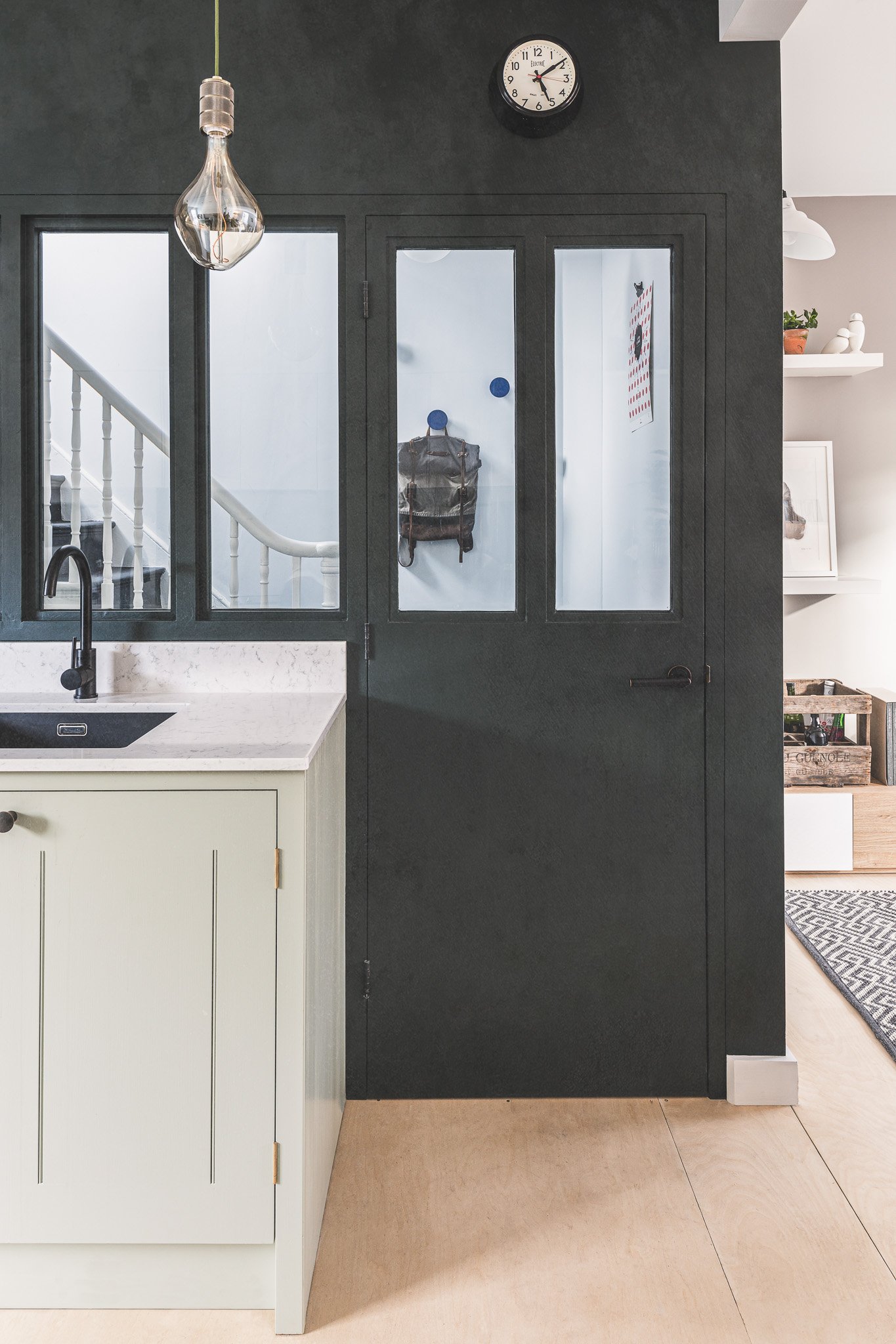
We got straight to work removing a section of the wall between the kitchen and the living room to create an open plan space full of light. Then to give the kitchen a further sense of openness, we installed a glazed door allowing a window into the hallway. We went one step further with this by using the level of the panes in the door to insert three more windows across the top of the kitchen sink. This congruence was enhanced by the uniform colour across the wall and the door giving the illusion of continuity unbroken by the door frame. Of course, the windows usher more light into the space but also a more pronounced sense of flow from the time that you enter the hallway and glimpse through into the kitchen while hanging up your coat.
THE HEART OF THE HOME
The kitchen was reconfigured so that the sink was no longer in front of the window where daylight was instantly blocked whenever it was in use. This also created a direct line between the kitchen window and the living room-dining room window, giving natural light throughout the day. We fitted Ikea wall units in reflective white while British Standard cupboards painted in a stone grey were topped with quartz worktops and bespoke handles. Sculptural pendant bulbs over the new kitchen sink added interest as well as functionality, beautifully framed by the gallery of windows behind.
EVERYTHING IS ILLUMINATED
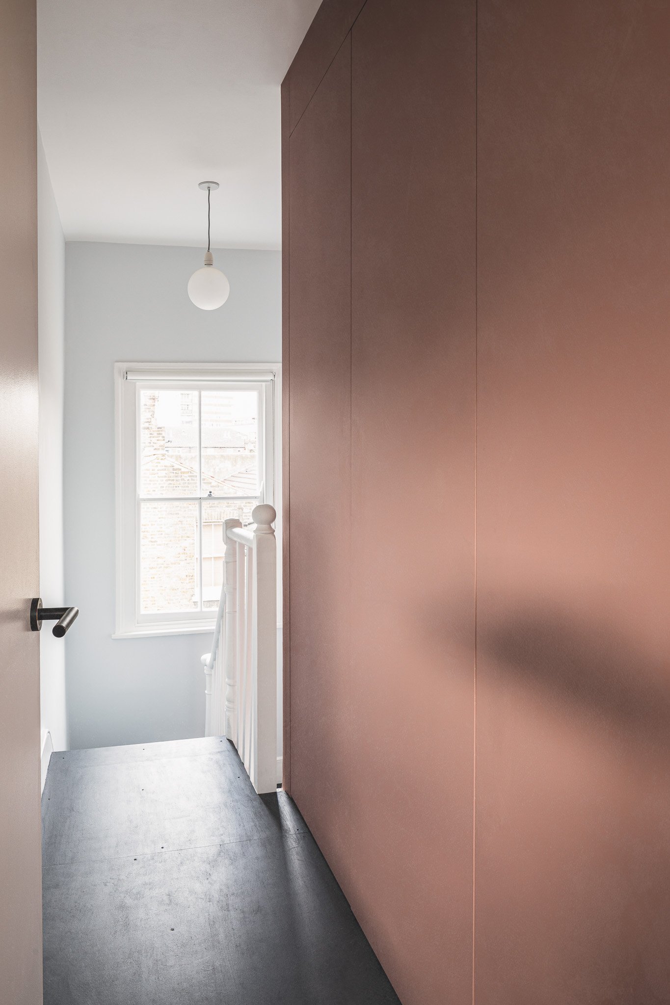
The bathroom door was also replaced with a glazed door allowing us to direct even more natural light into what was a very dark and enclosed space in the hallway. The bathroom was reconfigured so that there was a direct line from the window to the glazed door specifically for this reason. The bath was moved to the left-hand side and lit with a neat LED strip. We played with natural light wherever we could and employed the trick of contrasts with a lick of a darker shade of paint in specific areas. For example, the left-hand wall in the living room area was the perfect canvas for shadows from the south-facing window in the afternoons and evenings. Painting that wall a dove grey added a touch of theatre and depth to the dancing shadows. The upstairs hallway floor was painted a charcoal hue which reflected light rather than absorbed it. This also had the practical job of unifying the new birch floor with the original staircase which was made of a different coloured wood.
A HIDDEN ROOM
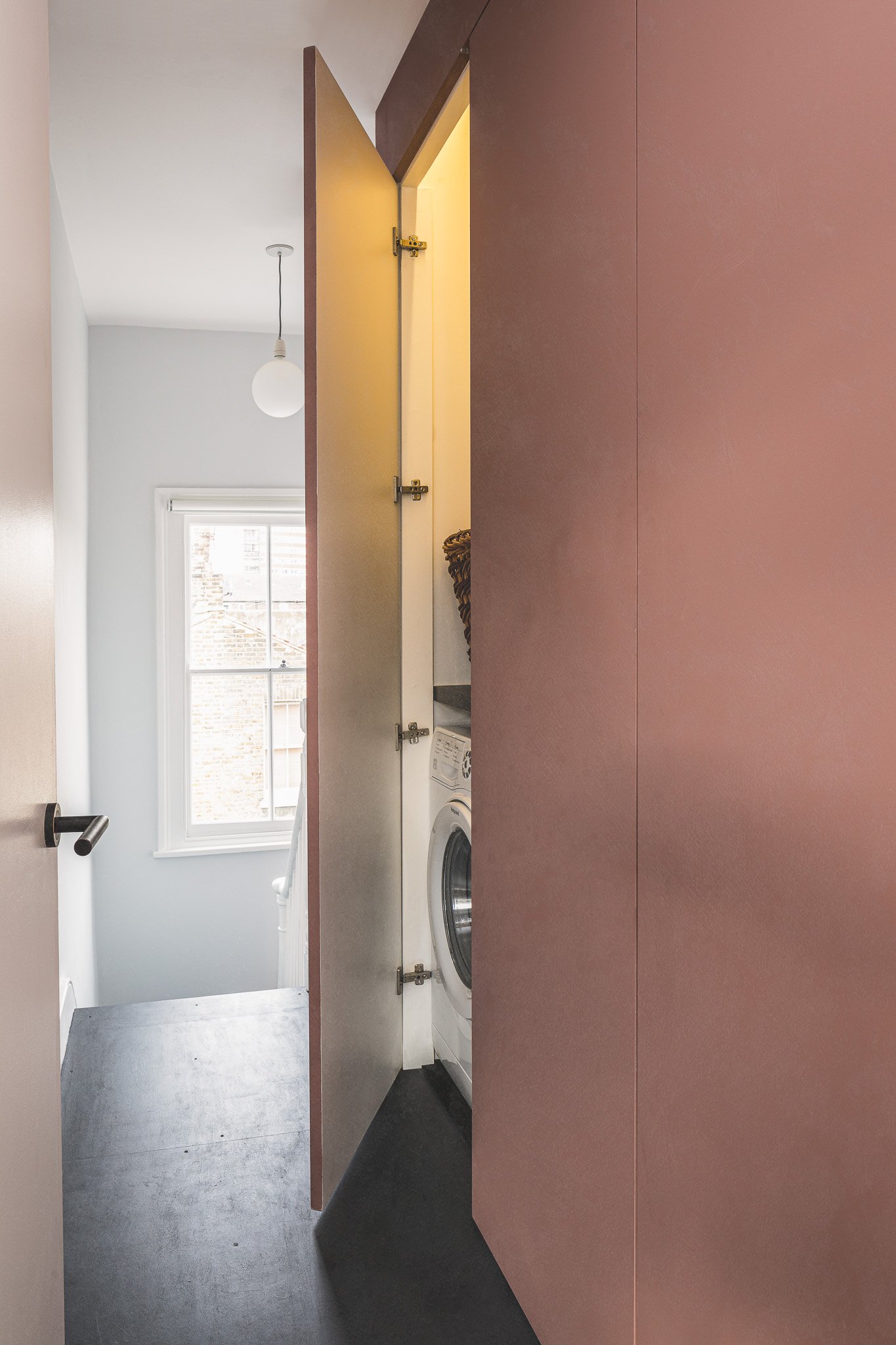
We took a bold step and created a utility cupboard in the dead space at the top of the stairs. Here, the washing machine, drier and boiler are out of the way behind acoustic doors and don’t cause any noise or disturbance in the downstairs living space. With the boiler and ventilation here it’s also ideal for drying linen, again, out of the way of living space and housemates. As a rental property, this is a particularly welcome detail for young professionals who may be sharing but is also more practical for a couple or small family. Thanks to the handleless doors, the cupboard sits flush and appears to be a regular wall to which we added a splash of colour with a warm dusky pink. A discreet bit of carpentry work at ceiling height hides the pipes and ducts exiting the cupboard which doubles as coving for an LED strip light. The master bedroom was also given fitted cupboards along one wall for added storage.
REDUCE AND RE-USE
We always try to re-use what we can on a job or else minimise unnecessary extra material by finding ways to make basics really sing. The structural birch ply used on the floor after the levelling work was held in place with brass screws, a design detail which finessed what would have been merely functional. Instead of replacing the stair boards to match the birch ply we used the same shade of paint that we used on the upstairs and downstairs hallways which also neatly tied in with the kitchen’s screen wall. It’s almost like the pathway throughout the home unfolds before you lit up by brilliant white walls. All existing windows were refurbished; the property has sash windows throughout except in the bathroom.
Do you have a project idea or something similar in mind?
We’d love to hear about it.


